Hansot
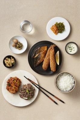
Refining the experience of a meal

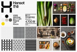

Symbol & patterns
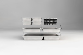
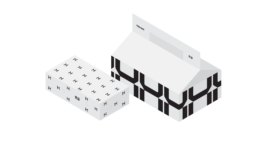
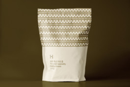
Packaging

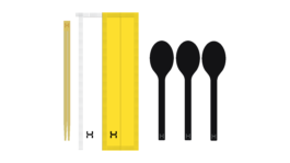

Adding color



Agency: Stockholm Design Lab
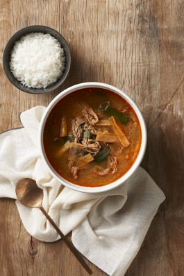
Photography: Jae-Hyun Park
Styling: Millie
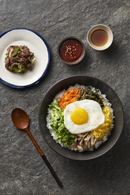
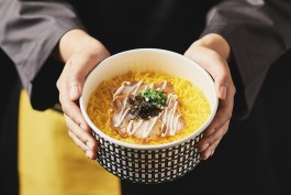
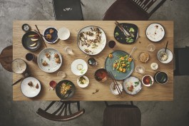
South Korea‘s leading dosirak franchise, Hansot, introduced their take-away concept in 1993. Ever since, it has grown into a franchise of more than 700 restaurants.
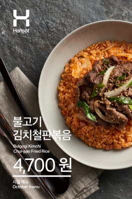
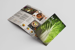
The objective was to work with strategy and design on a holistic brand transition programme with the ambition to create a sophisticated and progressive global brand for the future. The result is a broad identity design system, including everything from graphic elements, packaging, clothing, interior design, in-store digital and website.
www.hsd.co.kr


