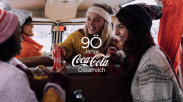
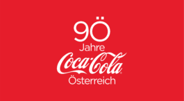
Campaign logo
The approach was simple – the zero in 90 was replaced by an "Ö" – the initial letter of Österreich (Austria). The added umlaut adds a unique graphic character to the anniversary number.
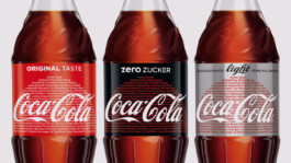
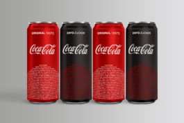
Campaign labels and cans
The circle has always been a strong element in the packaging design world of Coca-Cola and was the obvious fundament for the text based design of the labels, showing the 94 districts of Austria.
OOH/Citylights
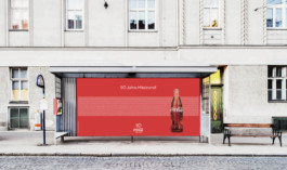
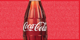
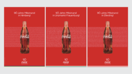
The Austrian flag and Coca-Cola have a thing or two in common. That coincident offers a springboard for an extra touch of regionality: for OOH the white strip of the Austrian flag was filled with all 2096 communities of Austria.


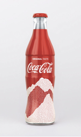
Ltd. edition
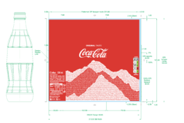
A mountainous silhouette carries on the idea to fill a shape with text, in this case the highest peaks of the alpine region. These elegant limited edition bottles were only sold on the highest peaks of Austria.
Agency: Obscura
Campaign design
In 1929 Coca Cola opened its first bottling plants in Austria. 90 years later, we provided a big stage for their alpine anniversary. “Miteinand” (togetherness) is a 360° communication campaign combining Coca Cola’s regional attachment with their core values.
Optimism, diversity and inclusion are the brand’s core building blocks as well as of the campaign. Coca Cola wanted to set a clear statement and reminder on the importance of unity at all times.
Apart from two TVCs and several online commercials, the campaign also comprised of a new interpretation of the Coke song. The print matter includes a new label design for all bottles with the name of all Austrian districts, OOH posters with the names of all Austrian local communities as well as regionalised city lights, delivering a strong message of regionality and unity.
© Bureau Lisa Fleck 2026